Typography plays a major role in delivering messages to the user in marketing. Knowing these 15 typography rules can help you deliver the message easier, faster, and the right way without misinforming.
I have divided these 15 rules into 4 sections based on the value they deliver and the connections they have.
Priority
Readability
Interesting
Avoiding
Prioritize based on the value
The most and the first important step in typography for marketing is to consider what is important, so we can show that to our visitors, first. We have 3 rules which help you get better in this section.
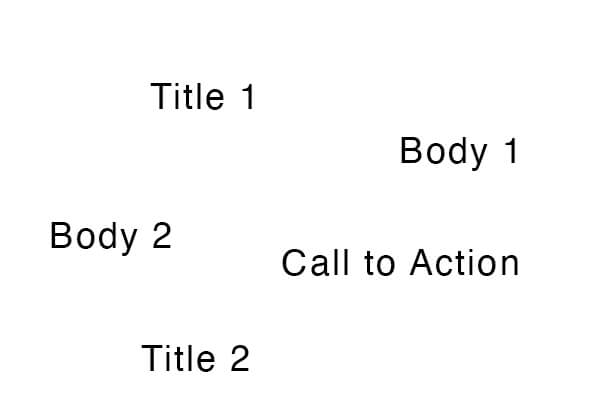
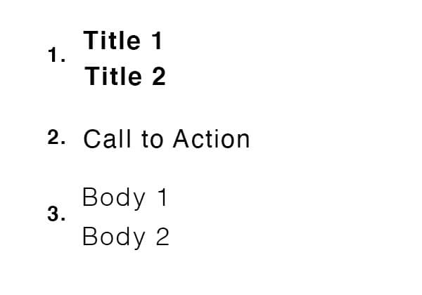
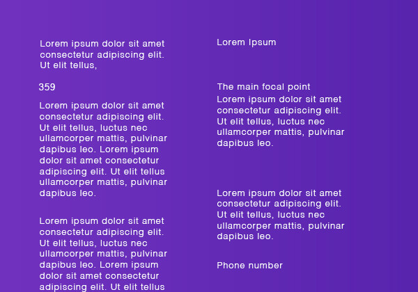
1. Create the list
It is important to know what you want visitors to see first and second and third, … . So the best practice for typography is to create a list of elements you want to have in a design, and arrange them based on priority. Later we will learn how to design these elements so the visitors view them in the order we want.
List of elements you want to have in a design
The list of elements in the order of priority to show to the users
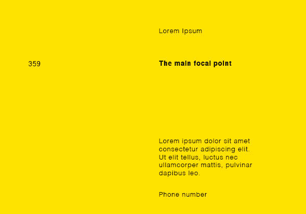
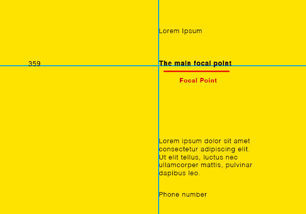
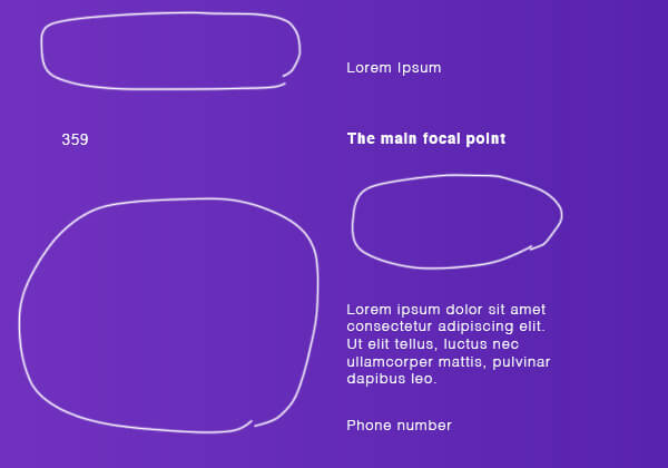
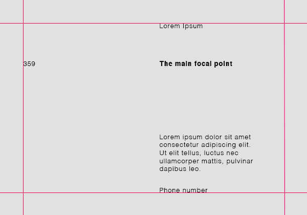
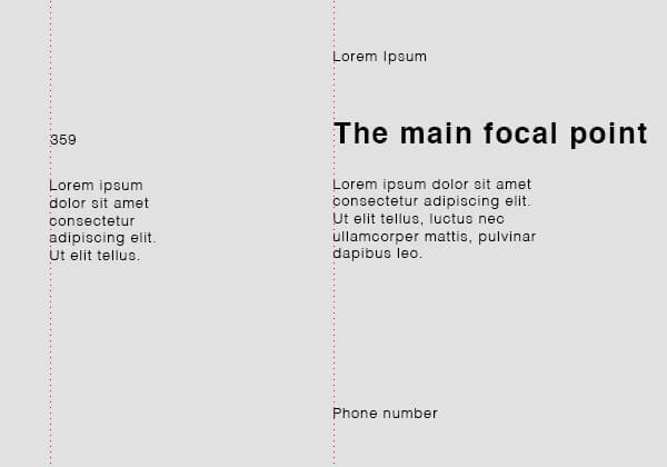
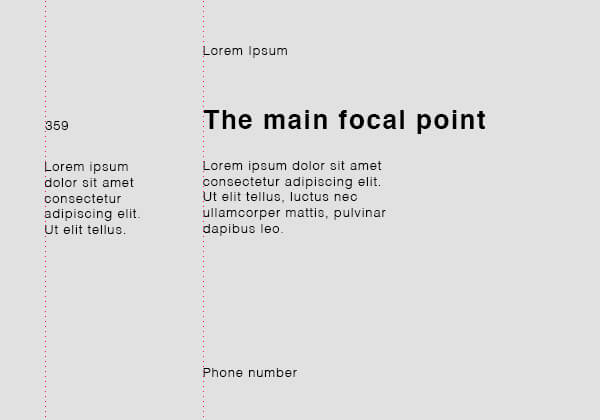
2. Select a focal point
A focal point is the second thing you need to consider in a design that connects all the elements together. Without a good focal point in marketing typography, all elements in the design would look lost with no connection to each other. Plus, the focal point will grab the attention first, so you should place the element with the highest priority.
The bold text is connecting all elements
The guide lines showing how the focal point works
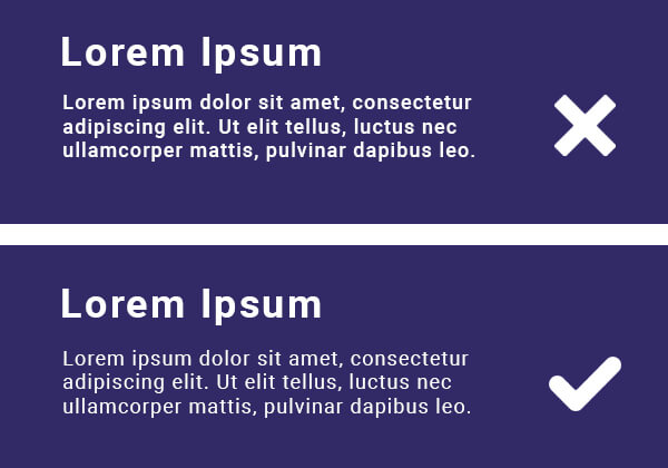
3. White spaces
To empty spaces in our design, we call white spaces which let your design breathe and drive the viewer’s attention to elements with high priority. Most people don’t notice the effect of white spaces in marketing which is huge.
Design without white spaces
Design with white spaces
Readability is the key
One of the main goals in marketing is to deliver a message very clear to the user’s brain, and there are many rules that will help us to make it easier and stronger. Not following the rules below may cause failure in marketing campaigns and hurting the business.
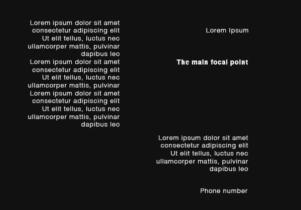
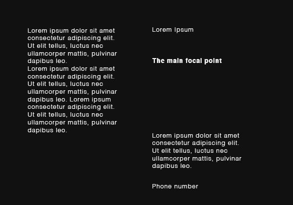
4. Justify
In most languages, we start writing/reading from top to bottom, left to right. So it is strongly suggested to justify your text to left rather than the center or right.
Texts are justified to right which is harder to read
Texts are justified to left and our eyes can track easier
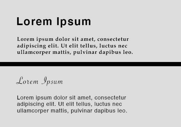
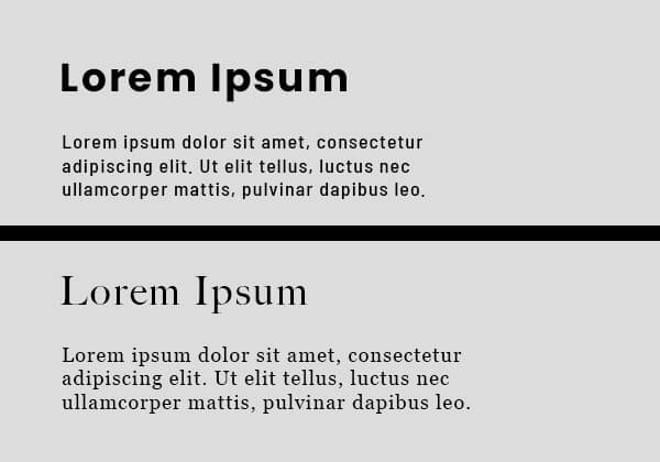
5. Use one font
Using two fonts successfully within a layout requires an understanding of the chosen fonts. Also, avoid using two fonts of the same classification.
2 different font type used together which we do not suggest at all!
One font type is used but 2 different font family - we do not suggest at all!
Here are the main 5 font types that you should know about and learn the differences:
Sample
Serif
Sample
Sans Serif
Sample
Display
Sample
Handwriting
Sample
Monospace
You can see different font types and learn more about them at Google fonts. All the fonts here are free to download.
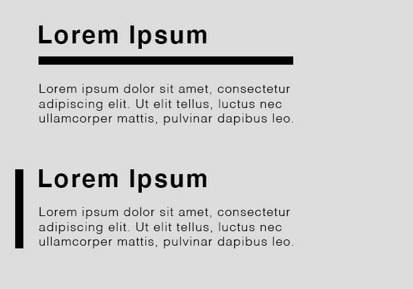
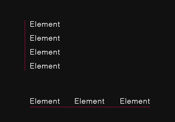
6. Group by using rules/lines
Group related blocks of information with lines, shapes, spaces. Grouping them makes it easier for the reader to understand they are connected or not. You can deliver your message easier when the texts are understandable.
A: Grouped by spacing - B: Grouped by shape
Grouped by line
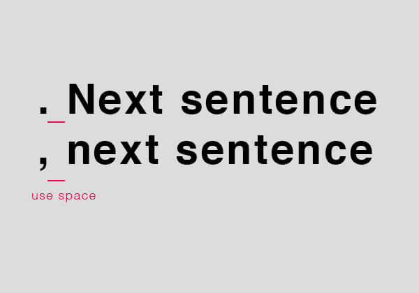
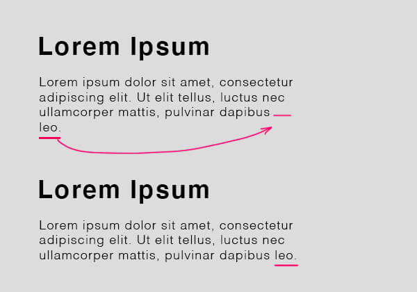
7. Mind the gap
Typography is all about spacing. There are several rules here you need to pay attention to all the time.
Use a single space after punctuation in a sentence.
Avoid having a single word on the last line of a paragraph.
Don’t begin a new page or column with the final word or line from a previous paragraph
Use a single space after punctuation
Never end a paragraph with a single word or known as widow
Make it interesting
The next step is to follow some rules that not only increase the readability but also they make the text look more interesting. following these rules will give a specific taste to your design and make it look more professional.
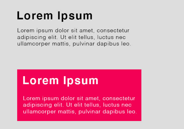
8. Skip a weight
Contrast is important in a design, especially when you want to make a point so I strongly suggest skipping a weight. Below you can see some samples with and without skipping a weight and you can notice how important it is. Even though the difference may seem little but it has a huge effect on the reader’s mind.
At the top we have Bold - Regular, but at the bottom we have Bold - Light
At the top we have Bold - Regular, but at the bottom we have Bold - Light
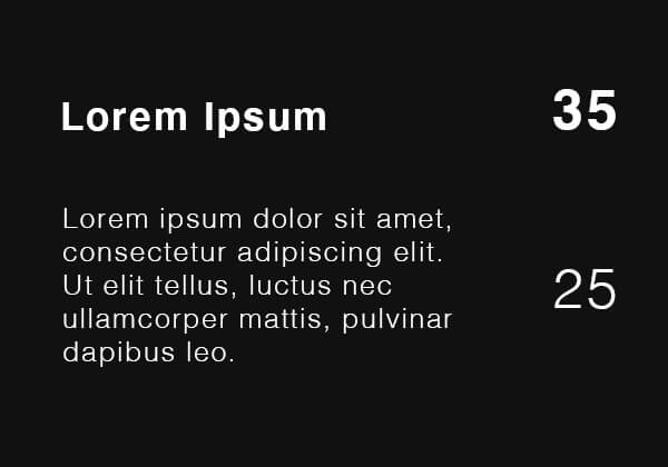
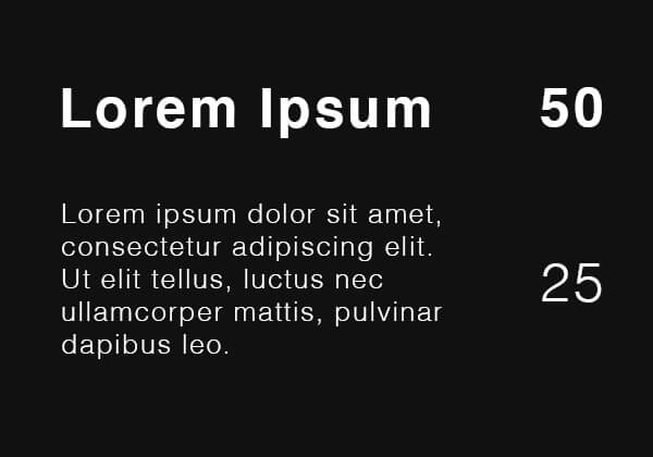
9. Double the size
My suggestion is when changing Point sizes, double or half the point size you are using. For example, if you are using 30 pt Type for the heading, use 15 pt type for the body copy.
Font size is NOT doubled
The font size is doubled which looks much better with more contrast
10. Good font matters
It is important to select a good font for your needs. From the marketing perspective, the font must be readable, meaning the fonts that are difficult to read like handwriting or display fonts are not suggested.
Here is a list of fonts I myself like to use:
Akzidenz Grostesk, Avenir, Avant Garde, Bell Gothic, Bodoni, Bembo, Caslon, Clarendon, Courier, Din Mittelschrift, Franklin Gothic, Frutiger, Futura, Garamond, Gill Sans, Gotham, Helvetica, Letter Gothic, Memphis, Meta, OCRB, Rockwell, Sabon, Trade Gothic, Trajan and Univers, Open sans, Roboto.
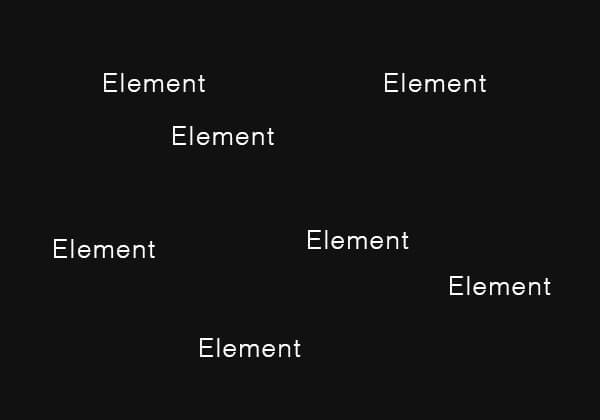
11. Select one axis
In your designs just select one axis for a block of information and avoid placing them randomly.
Placing elements without any axis randomly
Using vertical or horizontal axis
What you should avoid
There are several mistakes people make in typography especially regarding marketing that you should avoid. Avoiding these will increase the quality of your design and make it easier to understand.
12. Avoid corners
I suggest you create an empty frame around your design and do not cross that. Do not put anything on corners unless you want to cut a shape or text with a specific purpose in mind.
I also suggest you keep an equal distance from all sides, especially if you are designing for social media platforms. It may not be very visible but it completely change the look of your design an make it more professional.
The design without showing the guid lines
The design with equal distance from all sides
13. Avoid mixing fonts
I pointed out this rule before but it is so important to go over it again. Some people think using different in the same design will grab more attention. It won’t, do not use more than one font, if you do not have advanced typography knowledge to know what type of fonts you should mix together.
14. Avoid equal grids
Having a grid system for your designs is very important and helpful. It is a great tip not to divide your design into 2 or more equal sections.
Equal grid lines - NOT recommended
Not equal grid line which looks much better
15. Avoid complications
A good design is a design that includes room to breathe, so do not think you should add a ton of information, texts, elements into your design. The simpler the better. Keep it simple, deliver the message to the viewer, and avoid making it complicated.
These were the 15 rules that can help you in typography and creating better designs, especially for marketing. Please take a moment and give us your feedback by leaving a comment below.
4.67votes
Article Rating
Subscribe
3 Comments
Oldest
NewestMost Voted
Inline Feedbacks
View all comments
Andrea
3 years ago
Pouya, I have done quite a bit of art and the “15 Typography Rules” are right on. Often we don’t know why we like an ad or brochure and these design elements have a lot to do with it. This is a great primer for anyone who has to make compelling writing.
Isabelle Beckwith
3 years ago
Thank you for this document. Is there a way to print it?
Casey Wintons
2 years ago
This article was on point. I made sure to save it to my computer as a reference point. Thank you for taking the time to help people around the world with your gift. I appreciate you.


Pouya,
I have done quite a bit of art and the “15 Typography Rules” are right on. Often we don’t know why we like an ad or brochure and these design elements have a lot to do with it. This is a great primer for anyone who has to make compelling writing.
Thank you for this document. Is there a way to print it?
This article was on point. I made sure to save it to my computer as a reference point. Thank you for taking the time to help people around the world with your gift. I appreciate you.